With all the colour, imagery, displays and objects that make up an exhibition, you might not give much thought to the logo under which they all sit, but for design managers like Questacon’s John Richardson, the logo has to express the soul of the exhibition.
Every exhibition at Questacon carries its own unique logo designed to convey the distinct graphic identity of the exhibition.
John Richardson has overseen the design of numerous exhibition logos at Questacon and explains how the logo informs the look of the entire exhibition. "The logo is usually the starting point for the graphic identity of an exhibition. Once settled, it sets the style for the rest of the graphic elements of the exhibition. Visitors see the logo in promotional material and then at the entry to the exhibition itself."
John says the creation of these logos is far from arbitrary. It begins with a deep understanding of the exhibition's purpose, its desired impact on visitors, and the key messages it aims to convey. "We often develop a series of mood words or a mind map for the exhibition, and these words help us create a relevant look and feel."
While a logo needs to visually represent quite a lot of information, John says it has its limitations. "As a symbol, a logo cannot capture everything we want to say, so we concentrate on key requirements. These requirements will differ from one exhibition to another and if you give 3 designers the same brief, they will likely produce three distinct logos, each with its own interpretation of the message.”
The final logo is determined through a collaborative effort at Questacon, ensuring it best fulfills the criteria and specific requirements, but there are further challenges. John emphasizes logos need to be very versatile. "The logo needs to be legible at 20mm in size but also look great enlarged to several meters across." This adaptability ensures that the logo remains effective in various contexts, from brochures and posters to exhibition banners and digital platforms.
Watch our video and you will see the logos that have graced some of Questacon’s exhibitions over the past 35 years. Below are some concepts and ideas each logo has encapsulated.
Sideshow: This visitor favourite explored the science and technology behind fun parks, from the thrill of rides to the mysteries of fortune-telling.
Australia in Space: Revealing the wonders of space exploration and the roles Australia plays in this global endeavour. This exhibition left visitors starry-eyed.
Mini Q: A hands-on experience designed for the very little ones, encouraging early scientific exploration.
Weather Watch: Explored the dynamic world of weather and meteorology, this exhibition provided insights into climate and natural phenomena.
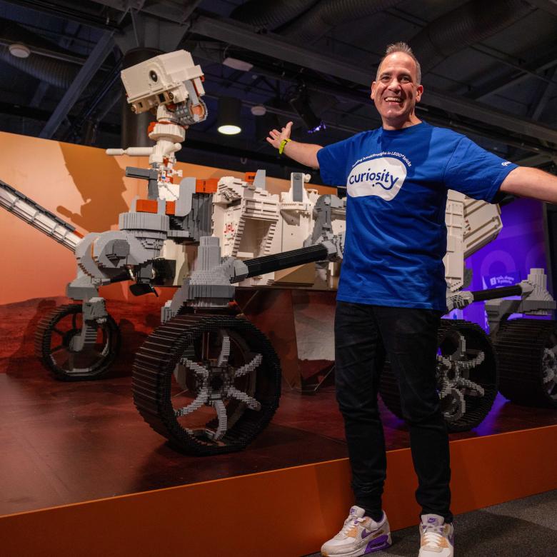
Mars: A deep dive into the mysteries of the red planet, offering a glimpse into the possibilities of future space exploration.
A Questacon exhibition logo isn't merely a symbol, it’s a pathway into a world of scientific discovery. Our logos also stand testament to the diversity of science the Centre has presented.
In the video you will find logos from the following exhibitions:
|
|
|
[Music plays and image appears of a four-way split screen showing the Our Water logo in the top left, the Imagination Factory Developed by Questacon logo in the top right, Sideshow The Science Behind Fun logo in the bottom left, and the Wavelength logo in the bottom right]
[Image changes to show the two logos at the top being exchanged for the Lab logo on the left and the Mars logo on the right]
[Image changes to show four new logos, Questacon Science on the move on the top left, Measure Island developed by Questacon on the top right, Math Amazing Developed by Questacon on the bottom left, and Born or Built? Our robotic future on the bottom right]
[Image changes to show four new logos, Fundamental on the top left, Awesome Earth on the top right, Under the Moon on the bottom left, and H20 Soak Up the Science on the bottom right]
[Image changes to show four new logos, Perception Deception Developed by Questacon on the top left, Terrorsaurus on the top right, Earth Quest Outer Space to Inner Earth on the bottom left, and Strike a Chord The Science of Music on the bottom right]
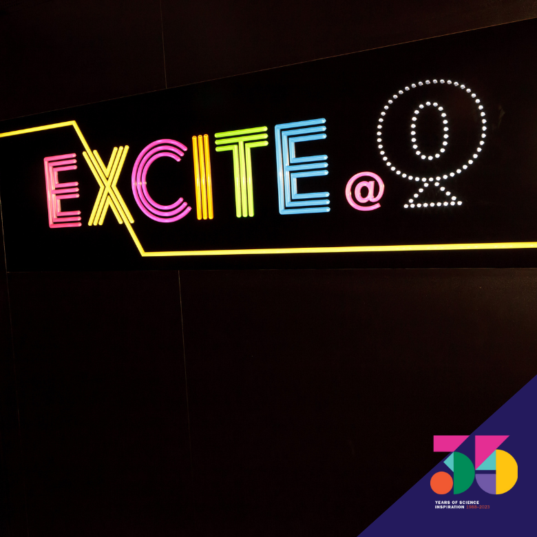
[Image changes to show four new logos, Excite on the top left, Burarra Gathering Sharing Indigenous Knowledge on the top right, Cybercity on the bottom left, and Mini Fun for 0-6 year olds on the bottom right]
[Image changes to show four new logos, Byte Wise Developed by Questacon on the top left, Questacon Fascinating Science on the top right, Colour - See the World in a New Light on the bottom left, and Questacon Science Play on the bottom right]
[Image changes to show four new logos, Our Clever Country on the top left, The Shed on the top right, Wonderworks Science to Move Your Mind on the bottom left, and Weather Watch on the bottom right]
[Image changes to show four new logos, Australia in Space on the top left, Questacon Roadzone - Educating Tomorrow’s Drivers on the top right, Seachest Secret - Unlock The Maritime Mystery on the bottom left, and Spiders on the bottom right]
[Image changes to show the number 35 made up of coloured shapes and text appears: 35 years of science inspiration 1988 – 2023].

